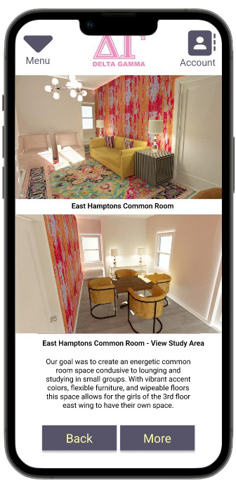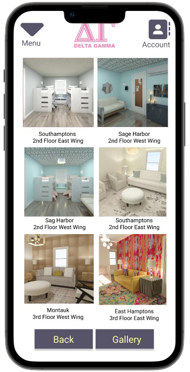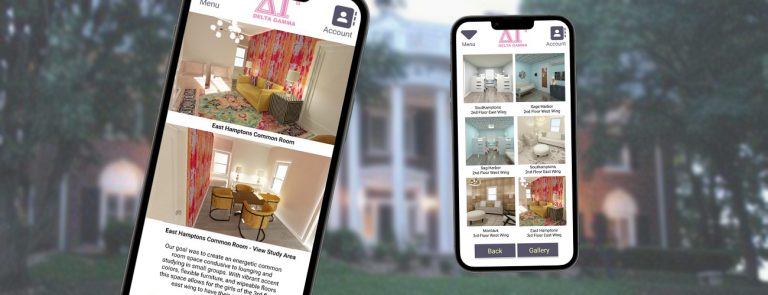
Challenge:
To improve functionality of living spaces at the Delta Gamma sorority house at the University of Kansas.
Also, to create a fundraising app as a means of achieving that end.
Project Overview:
The product:
A mobile app that helps active sorority members and their board organize fundraising opportunities,
which would then be used for living space improvements.
Project duration:
September 2015-2020
The problem:
Current students living in the sorority house are unhappy with the living arrangements and would like to make improvements.
The funding for such projects is limited.
The goal:
Design an app for local Delta Gamma members to plan for future improvements and organize the fundraising for said improvements.
My role:
UX Researcher and UX Designer designing the Delta Gamma app from conception to delivery.
Responsibilities:
Conducting unmoderated usability studies and online form surveys, interviews, paper and digital wireframing, low and high-fidelity prototyping, conducting usability studies, accounting for accessibility, and iterating on designs.
User Research:
Summary:
I conducted unmoderated usability studies, used online form surveys, and created empathy maps to understand the users I was designing for and their needs. I also coalesced this data into easy to read charts and graphs, which were presented to the stakeholders. An overwhelming majority of the girls wanted their own designated desk space. About half of the girls liked the idea of the sleeping dorms but at a much smaller scale. And almost 75% of the girls wanted a designated lounge space on each wing/floor.

Pain Points:

Space
Busy students need seperate, independent spaces where they can decompress and relax after a day full of classes.

Storage
Many students found the storage space for hanging clothes, shoes, and dressers lacking.

Money
The sorority's annual budget generally didn't account for quality of life upgrades. Any living space changes would have to be funded through other means.
Persona:
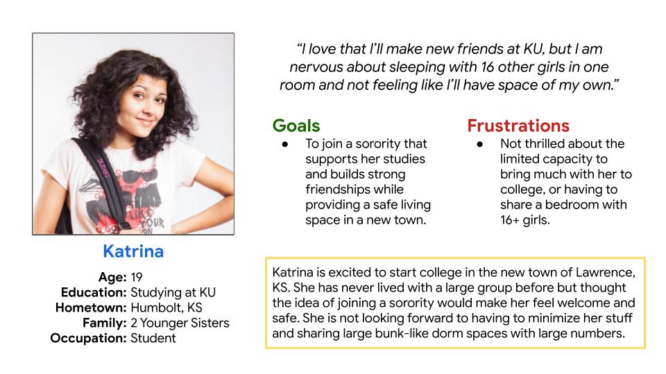
Problem statement:
Katrina is a 19 year old KU student that needs more room to herself in a large communal house. She needs space to store her belongings as well as a quiet, calming place to study.
User journey map:
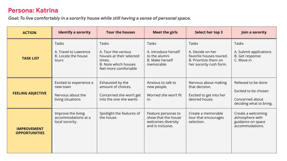
Mapping Katrina’s user journey revealed how important room size and personal space were in her decision to join Delta Gamma at KU.
Initial Designs:
Wireframes:
Low-Fidelity Prototype:
Mockups:
Takeaways:
Impact:
The app helps prospective Delta Gamma members decide if the sorority is the right fit for them, it assists current members with recruitment efforts, it helps plan future improvements to the house, and finally it supports fundraising effort for those improvements.
One quote from peer feedback: “This was so needed!”
What I learned:
In designing this app I realized that I could tackle quite a few of the girls’ problems all with one app. Through listening to the users and extensive research, the scope crept, but in the end they are left with one product that can do everything that meets their needs.
Next Steps:
- Conduct another round of usability studies to validate whether the pain points users experienced have been effectively addressed.
- Conduct more user research to determine any new areas of need.

